The following case studies reflect some of BDL Partners’ project experiences from around the world

Our Global Experience
We've Rebranded! Same Team, Exceptional Results.

Shell Cafe
GLOBAL implementation
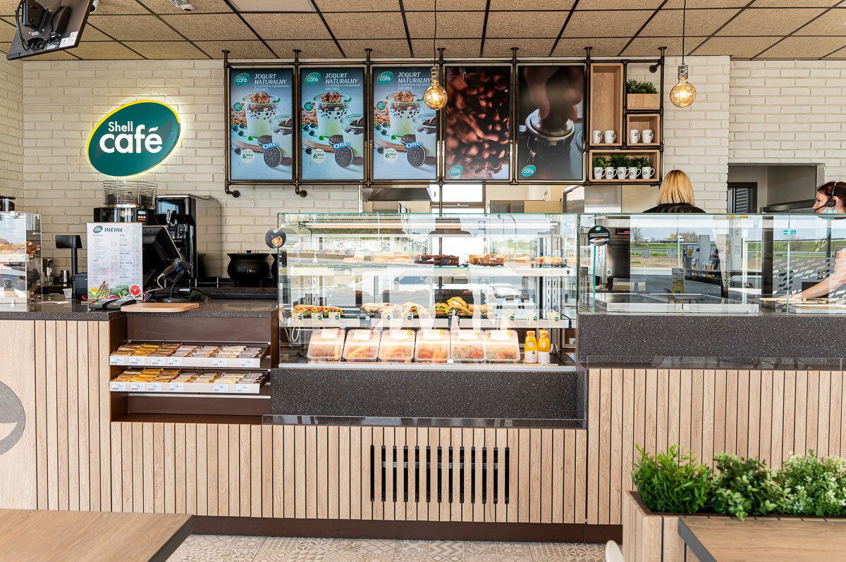
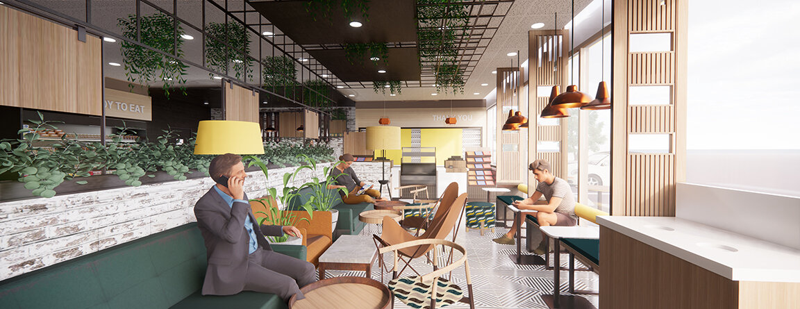
Texture, lighting, and warm tones were combined to visually create a hand-crafted, coffee centric experience and elevate consumer’s expectations of what they’ll find at a traditional forecourt shop. The barista-based service offer is highlighted by a reclaimed wood counter with a glass-enclosed food display, back wall coffee display with digital menus showcasing appetizing coffee impressions while providing specific details on menu offerings.


Ipiranga
Brazil
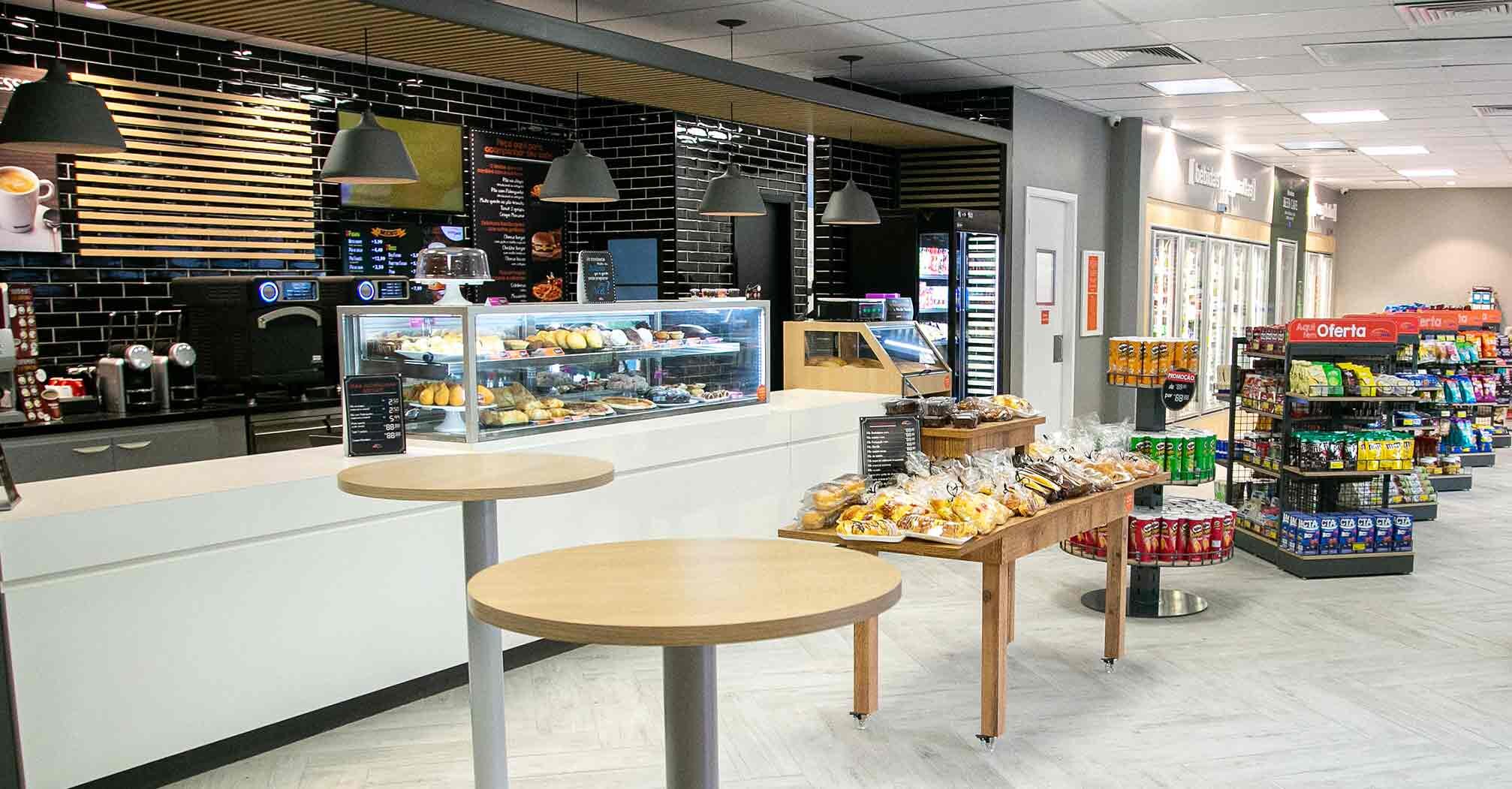
A new ampm design that elevates the overall brand experience by signaling, from the outside, the key differences found on the inside and creating a singular entry portal to help unify a divers retail portfolio. The interior design incorporates a wood trellis that “frames” and features the expanded food offering while dark wall tile helps to project a high quality and professional “foodvenience” experience. Layout was redeveloped bringing food and beverage to the forefront and to reinforce customer perceptions of ampm being the store of choice for meeting the daily needs of its mobile customers.



Adnoc, Oasis
UAE
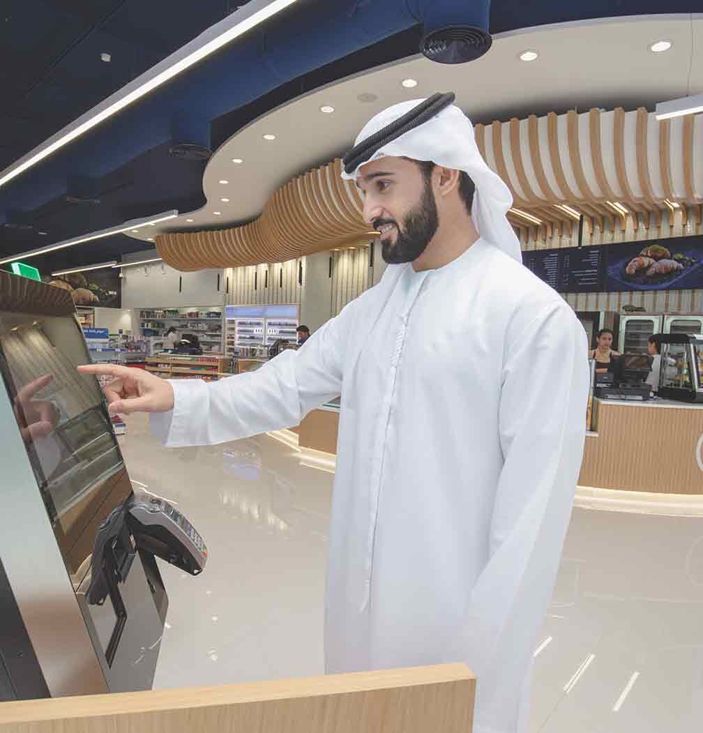
Inspired by the region’s rich heritage, and beautiful geography, BDL Partners brought to life the concept of sand dunes and the waves of the sea forming an oasis of great food and beverages. Dynamic ceiling treatment that highlights and features the new fresh food offers while creating a separate beverage island where barista coffee is combined with local tea offers and made to order Turkish coffee. We created an experience that was unique, memorable, and instantly recognizable so that regardless of store size or location the Oasis experience would be consistent.




Enex
CHILE
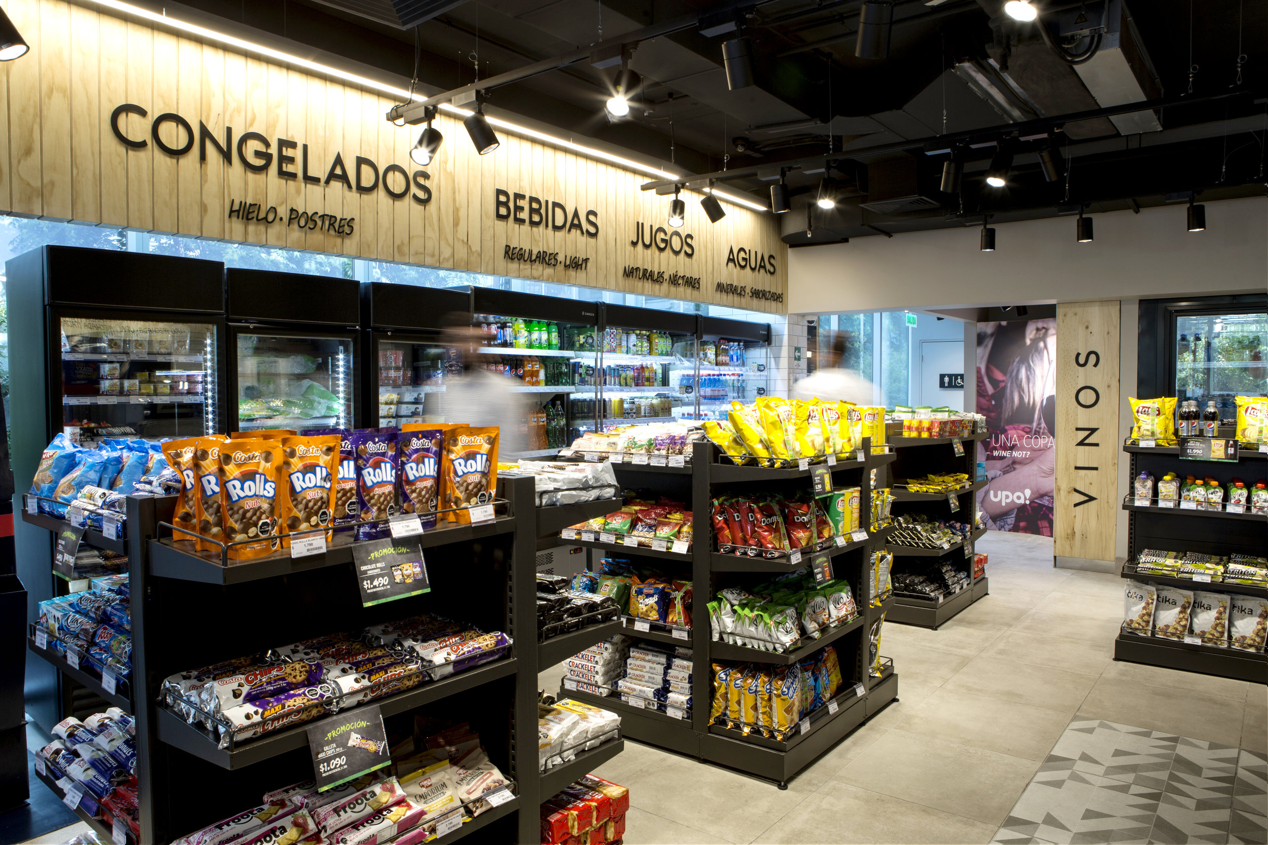
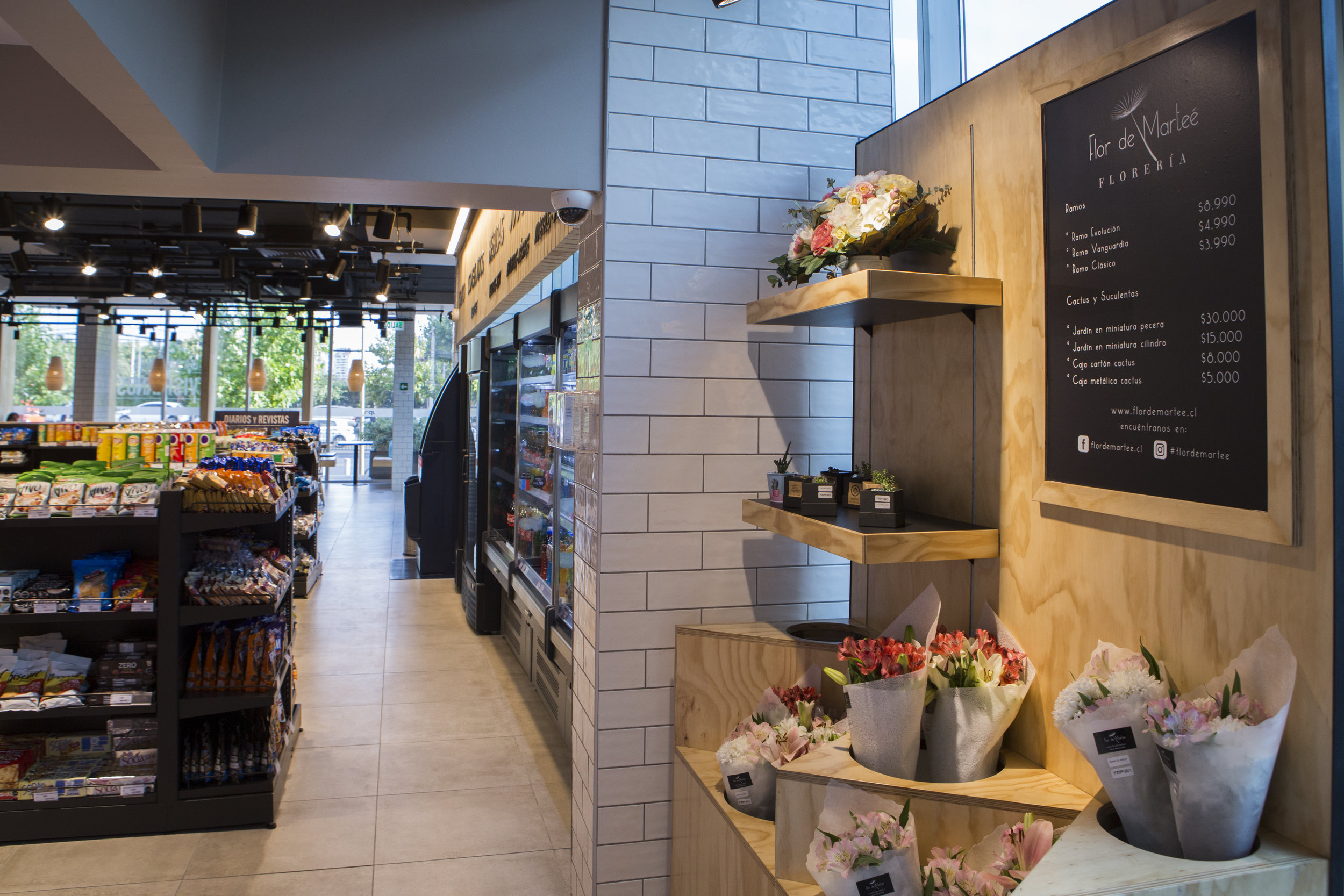
We created a new stand-alone retail destination in Apoquindo, Chile for Enex, a traditional fuels and convenience operator. The design intent was focused on delivering an authentic food and beverage experience by using an open layout with dramatic lighting to emphasize the food and beverage bar. The design includes a large seating area that provide guests with a casual and comfortable place to relax alone or to share friendly conversation with friends.




Oxxo
Mexico
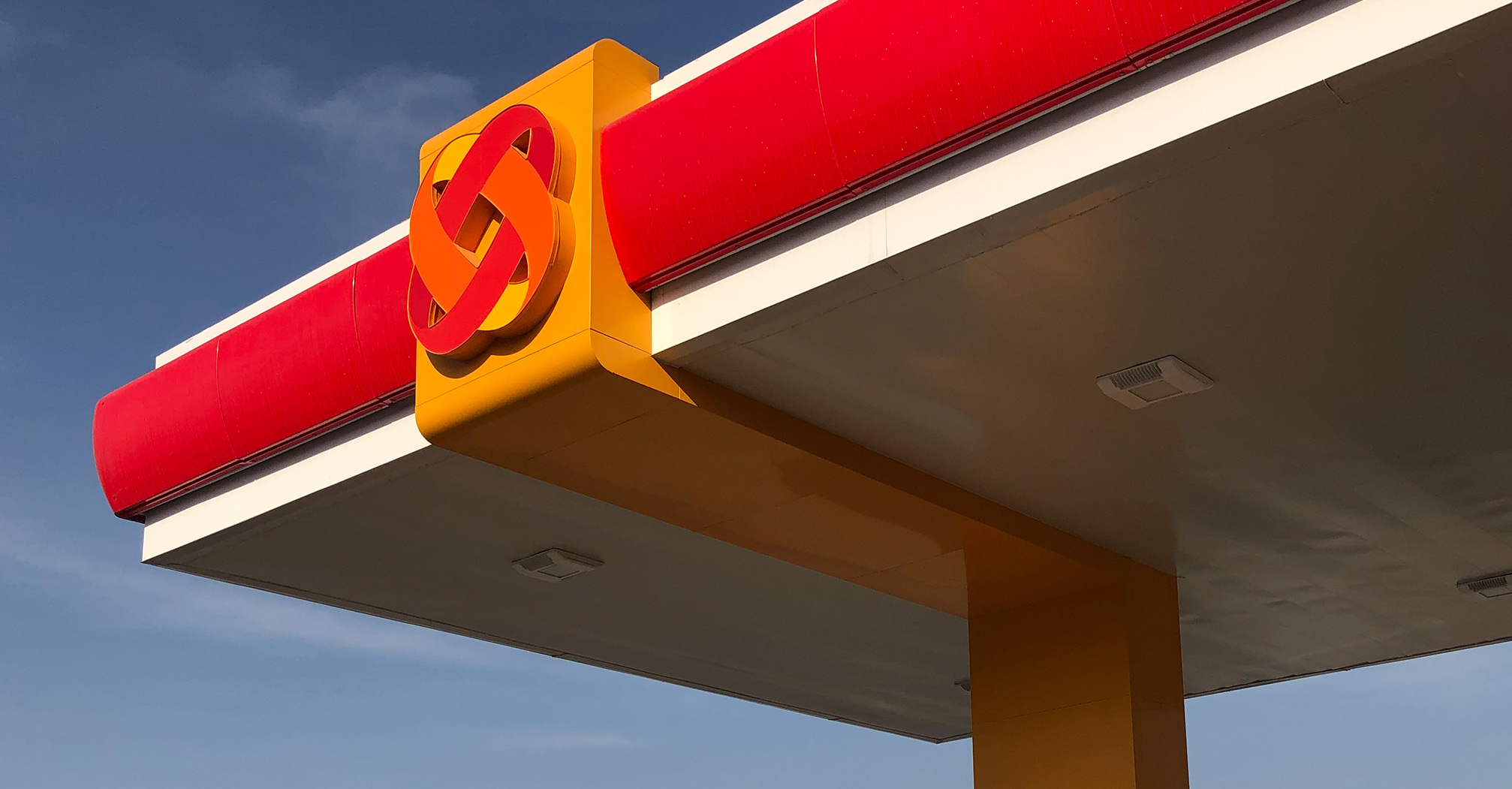
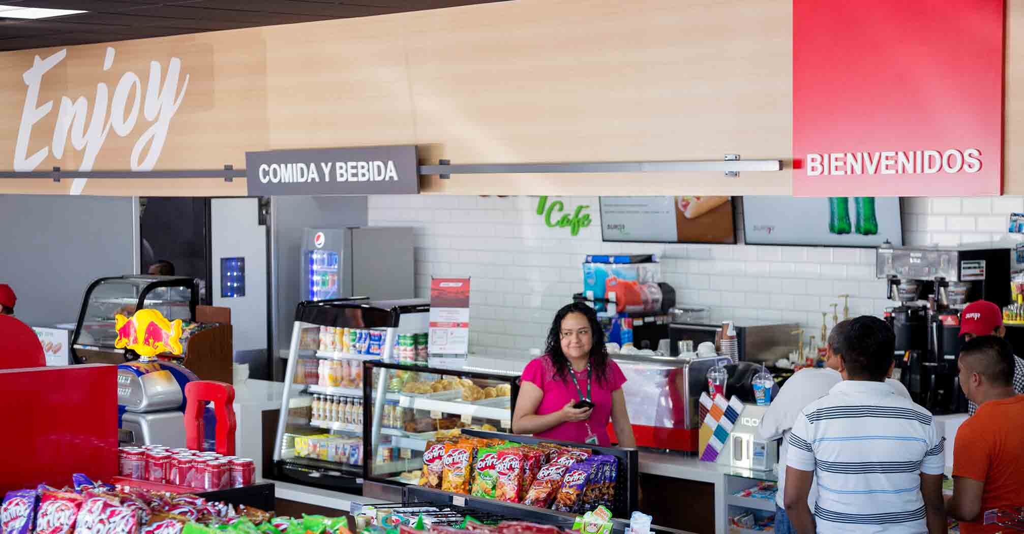
Faced with new regional competitors along with an influx of international oil companies, Oxxo Gas was looking to establish themselves as the preeminent leader in forecourt retail. The design leveraged and reinterpreted the visual assets of the Oxxo corporate brand through a dynamic red LED lit canopy, unique yellow banding and ‘energy’ icon that presents Oxxo Gas as being modern, innovative and in keeping with consumer expectations.


Migrolino
SWITZERLAND
We created an enhanced retail experience through a cost effective graphics and communications program that speaks to Migrolino’s high quality food choices in a state of the art convenience setting. In response to the guidelines established by the Zurich railway authority, the design was developed to be flexibility, modular and complimentary to the architectural surroundings.


Shell Select
United States
We used architecture to visually disrupt consumer’s usual expectations of what they’ll find at a gas station including adding outdoor seating to signal that this is a destination for food and beverage. Inside the store, layout and design work together placing a strong emphasis on the localized menu offerings.


Puma Energy
Switzerland
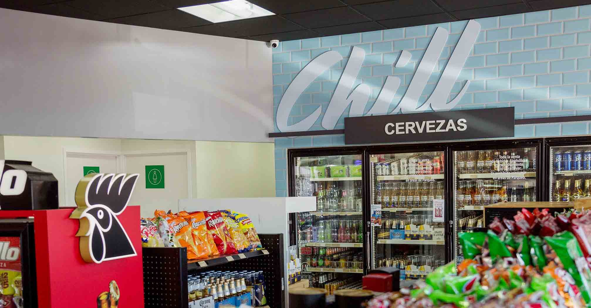
The next generation of Super7 store formats have been designed to enhance Puma’s retail experience, connect to their global audience, and signaling to all customers that they are an integral part of the community. The design focused on the key elements that are intended to deliver a sense of “local”in a meaningful and consistent way across Puma’s global network of retail stores.



Alltown
United States
We introduced a new food retail experience to capture the growing demand for higher quality food choices in a state of the art convenience setting. The design incorporated the use of natural materials, an open truss ceiling, dramatic lighting and digital technology to bring together classic old word style with a new era modern experience.


Nouria
United States
We developed an architectural “kit-of-parts” to assist Nouria with the rebranding and updating of their diverse portfolio of stores. The design highlighted the companies new logo and provided an open look into the store interior. The exterior design created a modern update to the companies legacy network while establishing Nouria as a unified branded chain.


Timewise
United States
Shell’s acquisition of 172 Timewise c-stores in Texas marks the company’s first significant entry into the U.S. market & its first operation of company-owned stores in 19 years.
We played a pivotal role in helping Shell evolve and modernize the design and aesthetic of the existing Timewise locations. Our efforts included streamlining the façade of the convenience stores to align with a more contemporary look, enhancing the existing rollover car wash facilities, and updating the retail interiors to create a warmer, elevated food and beverage experience.


